
Brand
Standards

The purpose of this guide is to help you do your part to maintain consistent usage of the brandmark. This will serve to increase awareness and create emotional connections within our communities. The more single-minded we are, the more powerful the Assumption Life brand will become.
Every individual in the company is responsible for the integrity and consistency of the Assumption Life brand and should be familiar with its proper usage.
Following these guidelines will help maintain consistency across our organization, conveying unity and professionalism. Each impression of the brandmark will reinforce all the others, making the brand stronger each time it is seen.
The Assumption Life logo is made up of two distinct elements; the “A” brandmark and Assumption Life signature. The brandmark can be used alone, but no other symbol can be used to represent Assumption Life.
The signature must NEVER be used alone and must always include the brandmark.

Always maintain the minimum clearance space around the Assumption Life logo as indicated. The base measurement of (x) equals the total height of the 4 stripes in the “A” brandmark.
The Minimum size has been carefully established to ensure the Assumption Life logo is reproduced correctly in smaller sizes. At Minimum size, the logo is still clearly legible and provides a strong level of identification. When using a lower-quality printing technique (i.e. screenprinting), it is recommended that the logo be used in a larger size.


The consistent and correct application of the Assumption Life logo are essential. Always follow the standards presented in these guidelines. The examples on this page illustrate some of the unacceptable uses of the Assumption Life logo. Although on vertical versions are shown, these rules apply to all versions - horizontal, vertical, English, French and bilingual.


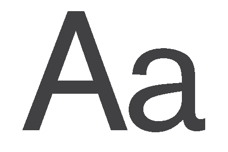
The Raleway typeface family has been chosen for all Assumption Life brand and communication materials. It was selected for its visual compatibility with the Assumption Life logo and for its ability to convey a personality that is approachable, functional and professional – all qualities that are consistent with the Assumption Life brand.

Colour is a key component of the Assumption Life brand identity. Corporate colours, carefully applied, will strengthen brand recognition, create impact,and impart a consistent look and feel to all Assumption Life communications across various media types and materials.

CMYK: 92/70/0/0
RGB: 32/92/170
Hex #205caa

CMYK: 35/8/2/0
RGB: 160/204/232
Hex #a0cce8

CMYK: 88/53/11/0
RGB: 25/113/170
Hex #1971aa

CMYK: 0/0/0/10
RGB: 230/231/232
Hex #231f20

CMYK: 0/0/0/90
RGB: 65/64/66
Hex #414042
CMYK: 0/0/0/90
RGB: 65/64/66
Hex #414042
Consistent and coordinated use of Assumption Life’s visual identity elements such as stationery is a vital part of preserving and enhancing the value of our brand. Assumption Life has one official format for letterhead, envelopes, business cards and presentation decks.
Assumption Life’s LinkedIn banner can be used for both internal employees.
DOWNLOADAssumption Life’s PowerPoint template is to be used for all electronic presentations for both internal and external audiences.
By using a consistent visual approach for presentations, you help maintain the strength of Assumption Life’s brand and project a professional, memorable image of Assumption Life to your audience.
Consistent and coordinated use of Assumption Life’s visual identity elements on stationery is a vital part of preserving and enhancing the value of our brand.
Assumption Life has one official format for letterhead, envelopes, and business cards.

